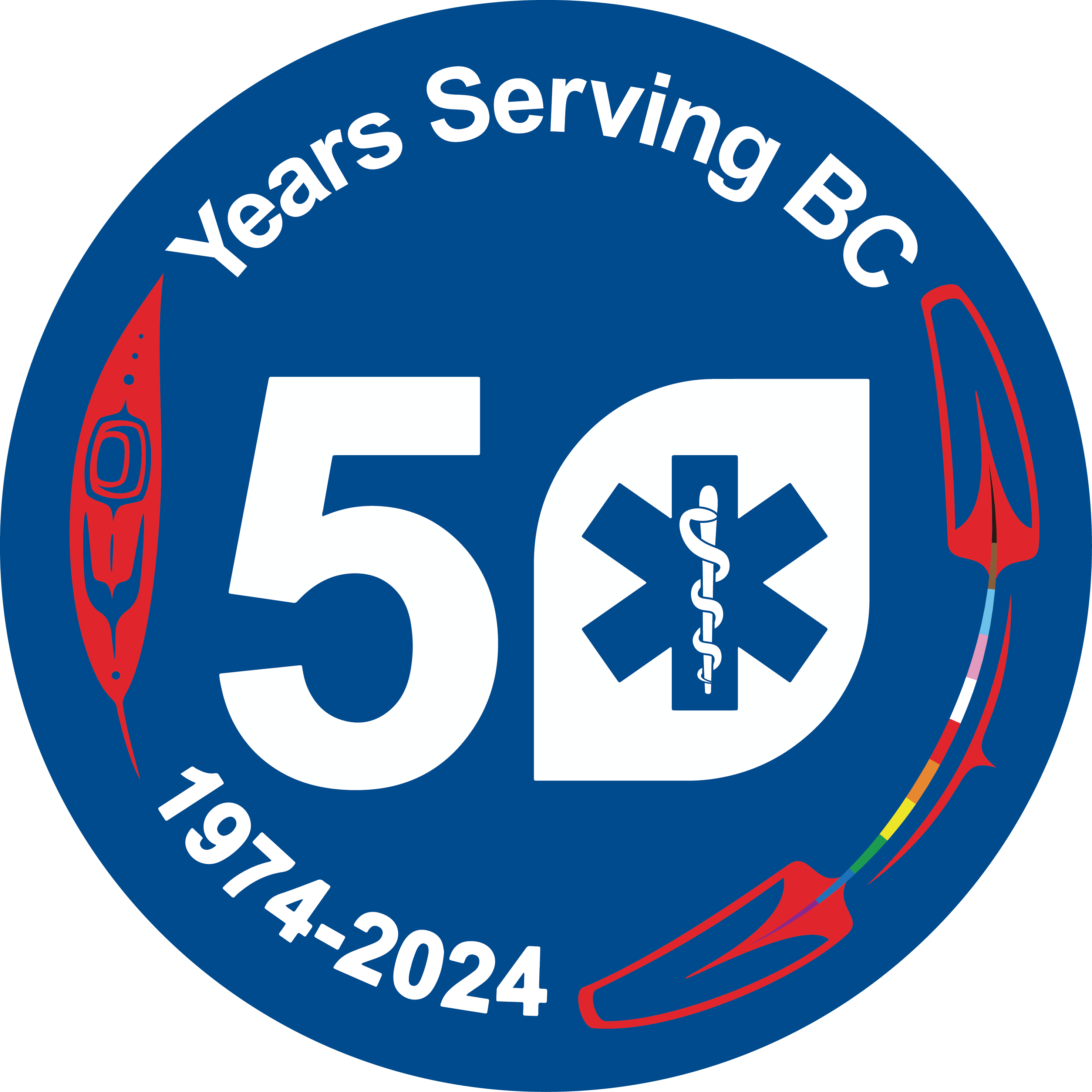
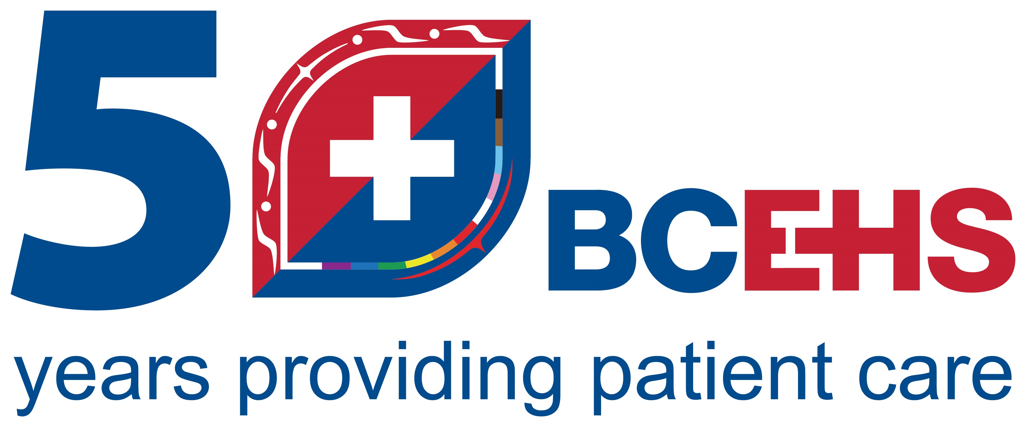
Over the next year, BCEHS is recognizing the 50th anniversary of BC’s provincial ambulance service. As part of the celebrations of this landmark milestone, we’ve introduced two new 50th anniversary logos, developed by Qwayacnit Hakuum (Natalee Dennis).
Qwayacnit Hakuum worked as a paramedic for ten years and is now a Manager, Indigenous Health at BCEHS. She is from Ahousaht, Manhousaht, Qwatswiaht and Hippy Point. She is also a gifted artist, who has contributed meaningful designs to the BCEHS community that incorporate symbols from First Nations culture.
This milestone year is an opportunity to both honour the remarkable contributions of everyone who’s been part of the ambulance service over the last 50 years, and celebrate the beginning of a new era at the organization, building on our collective strengths and working towards a culture that is more inclusive and supportive.
To this end, Qwayacnit Hakuum created two anniversary logos that honour our past and uphold the future vision of our organization. The logos uplift the changes we are currently undergoing to be an organization which welcomes and supports all. This includes our commitment to live within hišuk iš cawak and take action against Indigenous-specific racism and discrimination. It also upholds and represents our the patients, communities and employees we serve every day.
The logo designs were inspired by kaaʔinm̓it aḥ quʔasam̓it himwica, or The story of the Crow and all of its relations. Watch Qwayacnit Hakuum tell this story the story and explain how the values, morals and Indigenous law inspired the creation of our 50th anniversary logos:
Watch this video or read on to learn more about the meaning of each logo:
Leaning into kaaʔinm̓it aḥ quuʔasam̓it

The crow's feather on the left has four dots. One dot at the base for all medicine, both cultural, traditional, and western. Three dots at the tip of the feather for past, present, and future. The eye is being upheld and amplifies our work, while looking to the future, and holding space for the past. The feathers on the right are beaded together for strength and protection.

The design on the red side is the cedar tree seed, holding the stories, truths and histories of the past. It has four dots to represent the four quadrants of the medicine wheel and four of the sacred medicines, cedar, sage, sweetgrass and tobacco. By creating this space, we can put love, care and respect into the roots and seedlings of the future. The blue side represents the water that is needed to grow a cedar tree, and leans into kaaʔinm̓it aḥ quuʔasam̓it himwic̓a. Water is life, medicine, and our keeper for growth. With love, care and respect beaded between both sides of the seed, it assists in rooting the gifted Coast Salish Teaching kwum kwum stun shqwalowin and nuts a maht.
Go here to learn more about the Gifted Coast Salish Teachings gifted by Knowledge Keeper, Sulksun Shane Pointe.
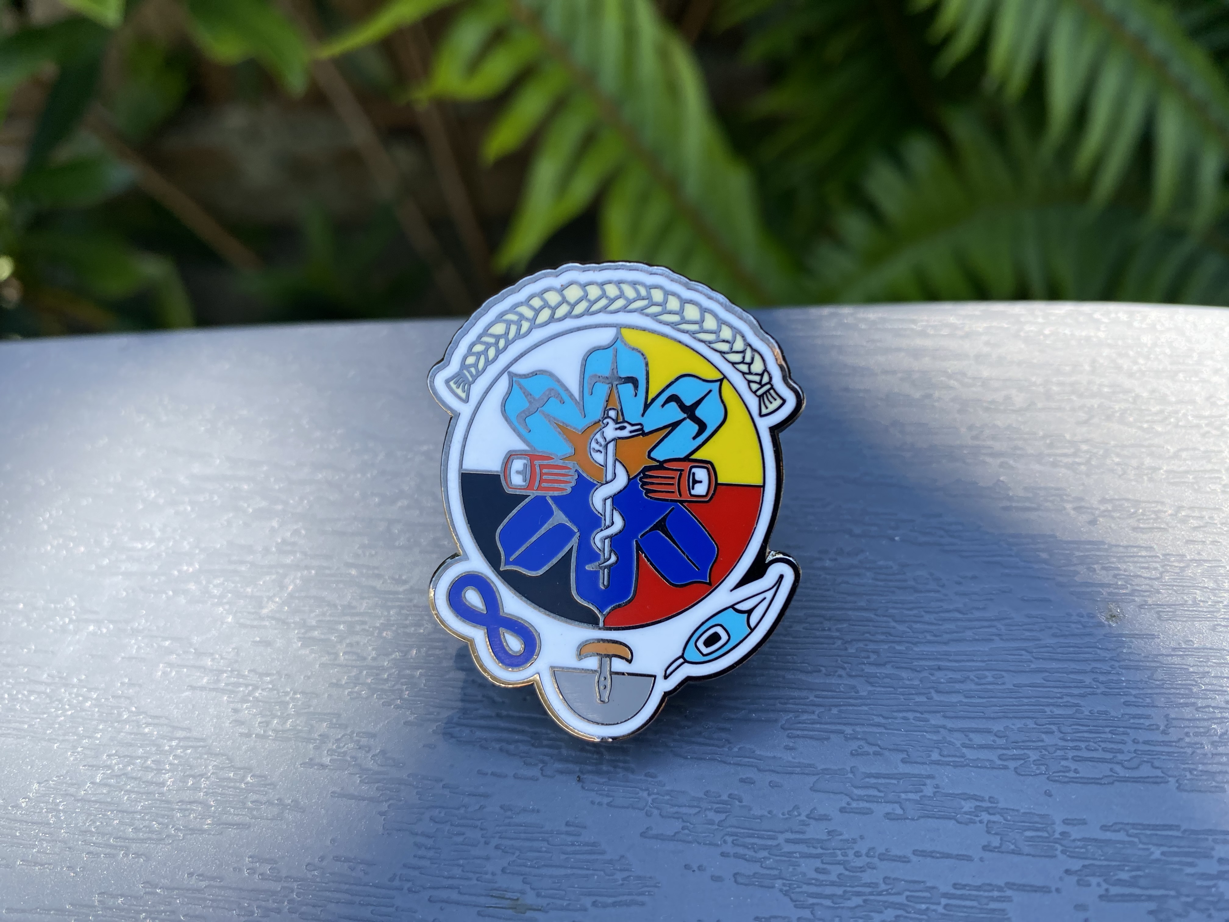
This isn’t the first time that Qwayacnit Hakuum has shared her artistic gifts with the BCEHS community. She also worked with Manager First Responder Services Lyndsay Kay on the design of the Indigenous Star of Life pin. Many paramedics, dispatch staff and support staff at BCEHS wear these pins to honour Indigenous culture and recognize the importance of ending the ongoing legacy of colonialism in health care.

We want to thank and uplift Qwayacnit Hakuum for the logos and sharing the meanings behind them.
